Maps use a rich set of symbols and other visual cues to indicate relative importance. Font size is widely used for this. Below are notes continuing from the previous post to filter map content based on the size of lettering.
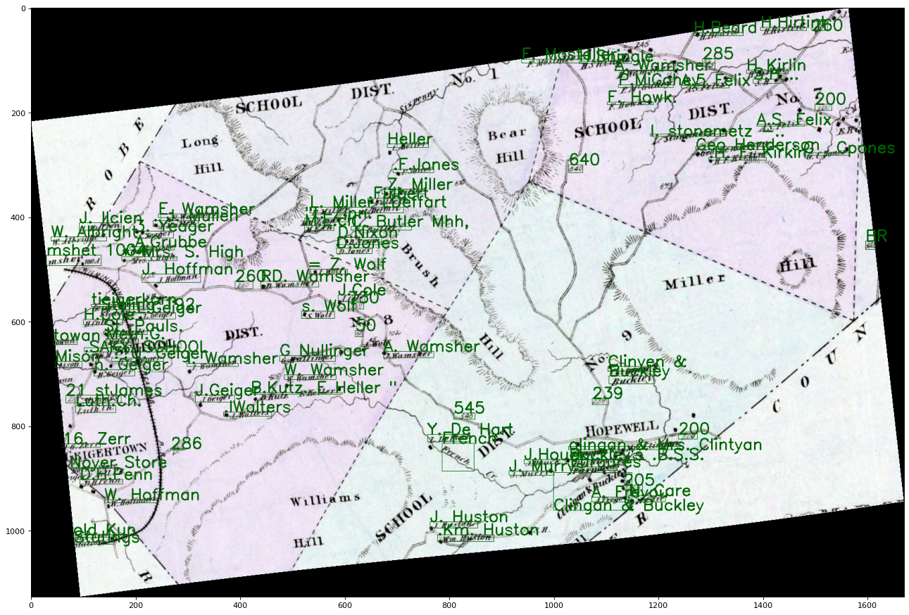
In this map, settlement names and geographic points of interest are labelled with large letters, shown in red, while property owner names are in a smaller font.
Map showing content with different font sizes.
The rectangles above come from coordinates provided by Azure Cognitive Services when it transcribes text. They provide a good approximation of the size of the text. A rough font size is calculated using the length of the rectangle divided by the number of letters in contains. The code is below.
import math
# Get the operation location (URL with an ID at the end) from the response
operation_location_remote = recognize_handw_results.headers["Operation-Location"]
# Grab the ID from the URL
operation_id = operation_location_remote.split("/")[-1]

# Call the "GET" API and wait for it to retrieve the results
while True:
    get_handw_text_results = computervision_client.get_read_result(operation_id)
    if get_handw_text_results.status not in ['notStarted', 'running']:
        break
    time.sleep(1)

# Print the detected text, line by line
# reads results returned by Azure Congitive Services
# puts results into the list "lines_of_text" to use later
lines_of_text = []
if get_handw_text_results.status == OperationStatusCodes.succeeded:
    for text_result in get_handw_text_results.analyze_result.read_results:
        for line in text_result.lines:
            line_data = []
            print(line.text)
            line_data.append(line.text)
            #print(line.bounding_box)
            line_data.append(line.bounding_box)
            pts = line_data[1]
            # Calculate the distance between the x points (x2 - x1)
            xd = abs(pts[4] - pts[0])
            # Calculate the distance between the y points (y2 - y1)
            yd = abs(pts[5] - pts[1])
            # calculate the length of the rectangle containing the words
            word_length = math.sqrt((xd ** 2) + (yd ** 2))

            letter_length = round(word_length/len(line.text)) # This is the rough font size
            print(letter_length)
            line_data.append(letter_length)
            lines_of_text.append(line_data)
With this calculation, here are some sample font sizes:
Text
Approximate font size
SCHOOL
24
DIST
19
E. Wamsher
12
.Z. Miller
8
(above) Table of text and relative font sizes.
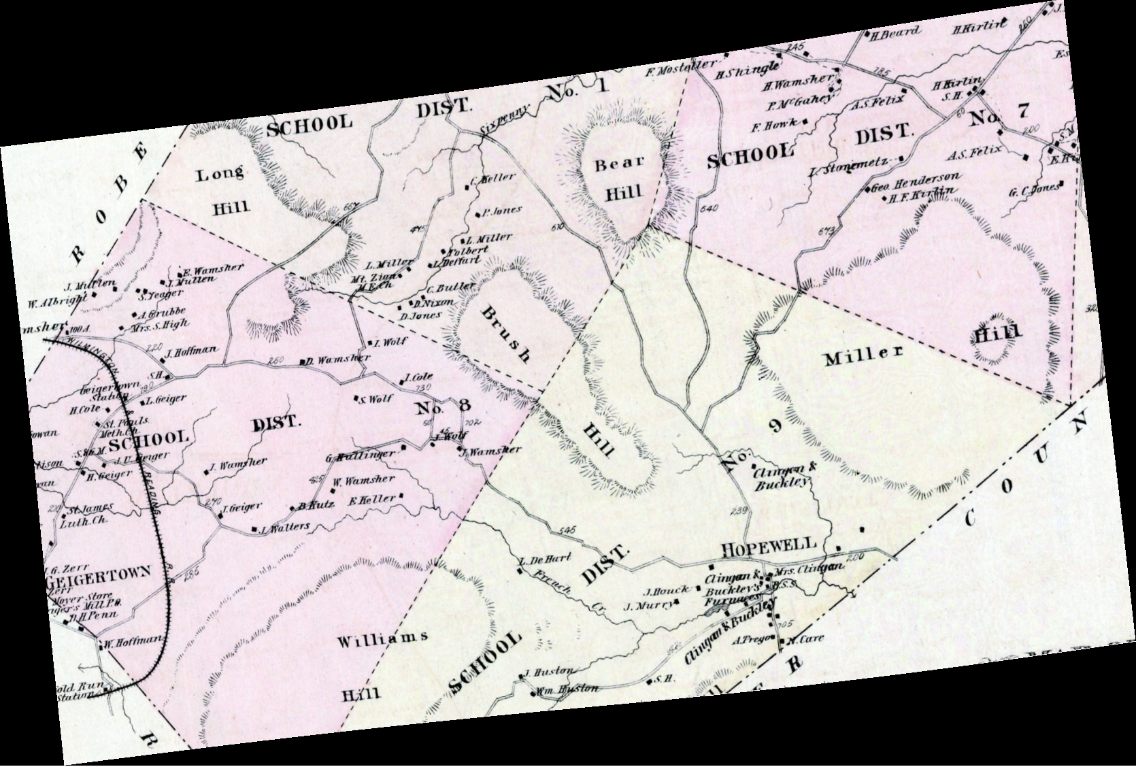
Setting a font size cut-off of 15 filters the content we want to keep from the larger font content:
for l in lines_of_text:
    pts = l[1]
    letter_size = l[2]

    fColor = fontColor
    if(letter_size < 15):

        # add text
        cv2.putText(img, l[0], (int(pts[0]),int(pts[1])),  font,  fontScale,  fColor, lineType)
        # add rectangle
        cv2.rectangle(img,(int(pts[0]),int(pts[1])),(int(pts[4]),int(pts[5])),fColor,1)
The map text filtered to show only small font size content.
Over the course of history, geography changes. Places signified on maps at one time can lose significance. Place names change and new ones emerge. This post is about reading a 19th century map to collect place names and position them geographically so they can be plotted on maps from other time periods to gain insight.
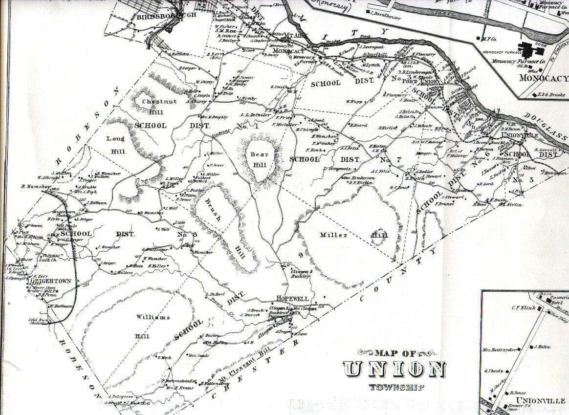
Below is a partial, georectified map of Union Township, Berks County Pennsylvania, 1876.[1]
Union Township, Berks County Pennsylvania, 1876.[1]
Microsoft’s Azure Cognitive Services can transcribe the text on the map, such as listed below. Dr. Shawn Graham documented how to set up Azure Cognitive Services. The python code I am using is linked at the end of the post.
H.Beard
F. Mostaller-
H.Hirtint
260
SCHOOL DIST.
H.Shingle
Eisprung
No. 1
A. Wamsher
... etc.
For each line of text Azure Cognitive Services recognizes on the map, Azure returns coordinates of a rectangle in the image where the text appears. Here is the map with an overlay of recognized text:
Map with an overlay of computer recognized text. Each blue rectangle represents the region where Azure Cognitive Services found text.
This map is a georectified tif provided by Dr. Ben Carter. Given we have pixel x,y coordinates for the image and know its geographic coordinate reference system is 32129 we can transform the image pixel coordinates into geographic ones and save them in a shapefile. The shapefile can then be plotted on other maps, like below:
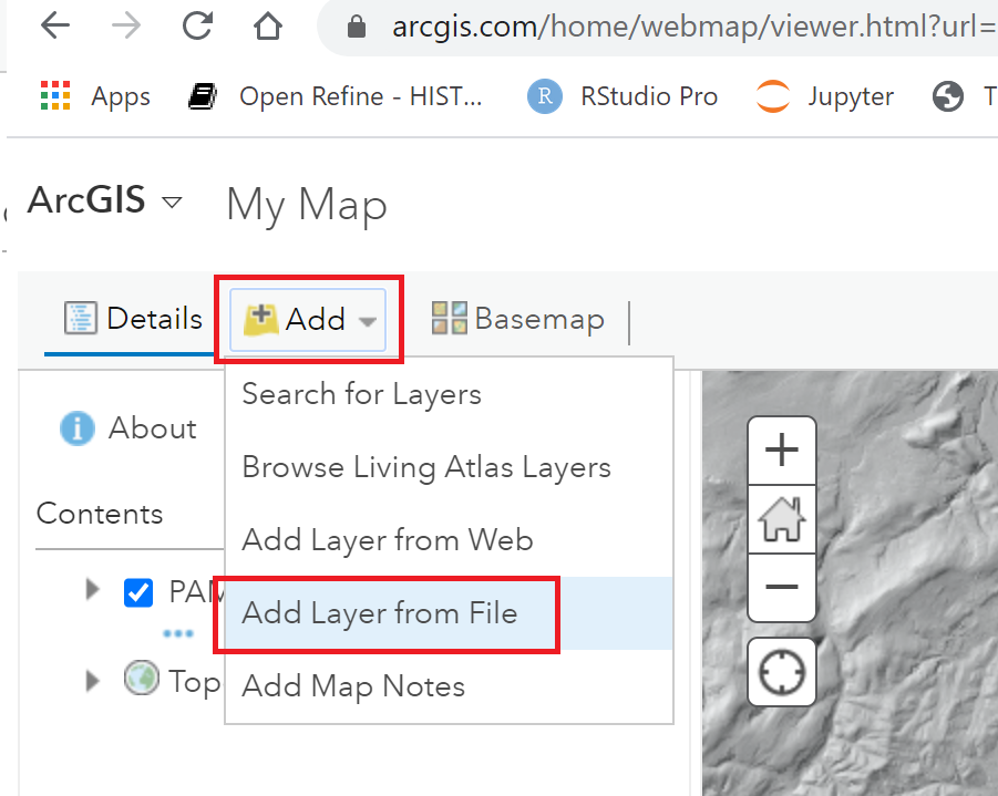
I clicked, Add | Add Layer from File and selected the zip of the line_text shapefile to import it. ArcGIS has options to set the color of polygons and display labels.
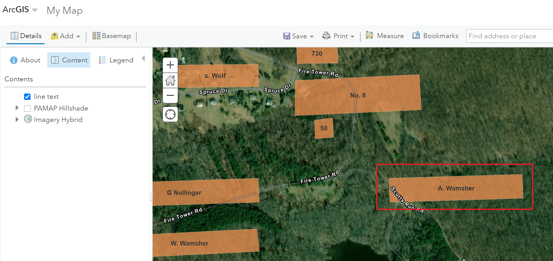
Add Layer from FileLine_text.shp plotted on a basemap.A close-up of a place labelled A. Wamsher in 1876.
As seen above, some places labelled in 1876 are not immediately evident on current maps. The place labelled A. Wamsher likely was a farm. Today this area is within Pennsylvania’s French Creek State Park. It appears to be a forest, perhaps second-growth.
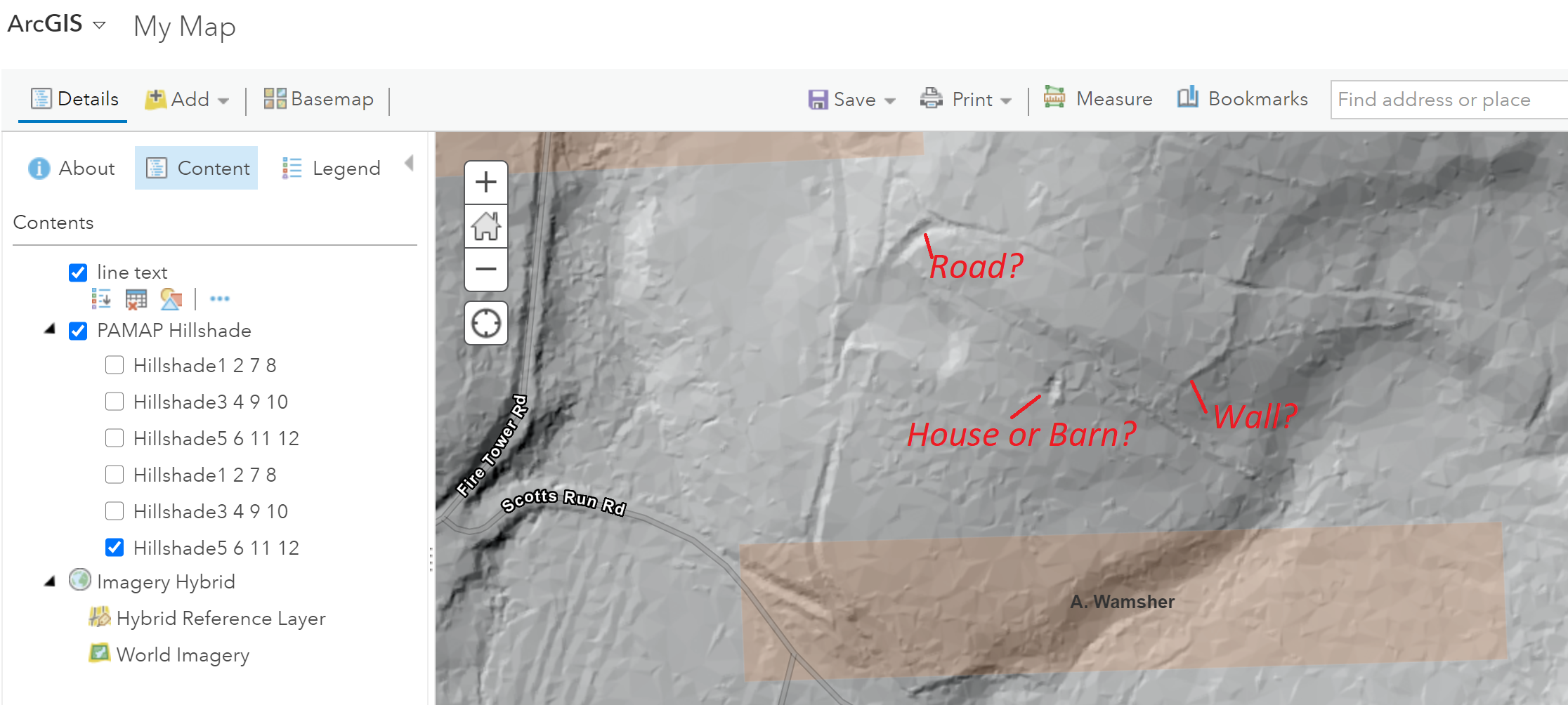
Adding PAMAP Hillshade shows additional features. It’s speculation, but are the ridges and depressions shown on the hillshade image remains of A. Wamsher’s farm?
[1] Davis, F. A., and H. L. Kochersperger. 1876. Illustrated Historical Atlas of Berks County, Penna. Union Township. Reading [Pa.]: Reading Pub. House.
I have a list of large rasters that I would like to check systematically to see if they cover the same area as a list of points. Below is a program to walk the files and subdirectories of a folder and for each .tif, see if it contains at least 1 point. I used Google Colab to run this.
!pip install rasterio
!pip install geopandas
import rasterio
import rasterio.plot
import geopandas as gpd
from shapely.geometry import Point, Polygon

amuquall_df=gpd.read_file("/content/drive/MyDrive/amuquall/data/amuqall.shp")
print(amuquall_df.crs)

def plot_tif(tif_path, amuquall_df):
    tif_file = rasterio.open(tif_path)
    # print(tif_path)
    # print(tif_file.shape)
    # print(tif_file.bounds,tif_file.bounds[1])

    # make a polygon of the tif
    t_left = tif_file.bounds[0]
    t_bottom = tif_file.bounds[1]
    t_right = tif_file.bounds[2]
    t_top = tif_file.bounds[3]
    coords = [(t_left, t_bottom), (t_right, t_bottom), (t_right, t_top), (t_left, t_top)]
    poly = Polygon(coords)
    print("raster crs: ", tif_file.crs)
    amuquall_df = amuquall_df.to_crs(tif_file.crs)
    print("points crs: ", amuquall_df.crs)
    tif_contains_points = False
    for pt in amuquall_df['geometry']:
        if(poly.contains(pt)):
            tif_contains_points = True
            break

    return(tif_contains_points)
import os
usable_tifs = []
unusable_tifs = []
for dirpath, dirs, files in os.walk("/content/drive/MyDrive/crane_ane/Satellite_Data"):
    for filename in files:
        fname = os.path.join(dirpath,filename)
        if fname.endswith('.tif'):
            print(fname)
            has_points = plot_tif(fname, amuquall_df)
            if(has_points == True):
                usable_tifs.append(fname)
            if(has_points == False):
                unusable_tifs.append(fname)
print("*** usable tifs ***")
print("\n".join(usable_tifs))
# print("*** UNusable tifs ***")
# print("\n".join(unusable_tifs))
Warning: count(): Parameter must be an array or an object that implements Countable in /home/jeffblac/public_html/wp-includes/formatting.php on line 3507
Recently for work I wanted to present information that was in an Excel file using Powerpoint. The data in the Excel file has ongoing edits and I wanted a way to make it easier to keep the Powerpoint presentation synched with what is in Excel. I didn’t want to copy and paste or edit in two places.
For this example, I’m using a spreadsheet of types of trees. Thanks to the former City of Ottawa Forests and Greenspace Advisory Committee for compiling this data.
Excel spreadsheets can be read by Python’s Pandas into a dataframe:
I wanted to take the dataframe and make a set of slides from it. Python-pptx creates Powerpoint files quite nicely. I installed it with: !pip install python-pptx
I created a class so that I could call python-pptx methods. The class would handle creating slides with tables, as per below. The full notebook is in Github.
from pptx import Presentation
from pptx.util import Inches, Pt
import pandas as pd

class Ppt_presentation:

    # class attribute
    # Creating presentation object
    ppt_presentation = Presentation()

    # instance attribute
    def __init__(self):
        self.ppt_presentation = Presentation()

    def get_ppt_presentation(self):
        return self.ppt_presentation

    # Adds one slide with text on it
    def add_slide_text(self, title_text, body_text):
        # Adding a blank slide in out ppt
        slide = self.ppt_presentation.slides.add_slide(self.ppt_presentation.slide_layouts[1])
        slide.shapes.title.text = title_text
        slide.shapes.title.text_frame.paragraphs[0].font.size = Pt(32)
        # Adjusting the width !
        x, y, cx, cy = Inches(.5), Inches(1.5), Inches(8.5), Inches(.5)
        shapes = slide.shapes
        body_shape = shapes.placeholders[1]
        tf = body_shape.text_frame
        tf.text = body_text

    # Adds one slide with a table on it.  The content of the table is a Pandas dataframe
    def add_slide_table_df(self, df, title_text, col_widths):
        # Adding a blank slide in out ppt
        slide = self.ppt_presentation.slides.add_slide(self.ppt_presentation.slide_layouts[5])
        slide.shapes.title.text = title_text
        slide.shapes.title.text_frame.paragraphs[0].font.size = Pt(32)
        # Adjusting the width !
        x, y, cx, cy = Inches(.5), Inches(1.5), Inches(8.5), Inches(.5)
        df_rows = df.shape[0]
        df_cols = df.shape[1]

        # Adding tables
        table = slide.shapes.add_table(df_rows+1, df_cols, x, y, cx, cy).table
        ccol = table.columns


        for c in range(0,df_cols):
            table.cell(0, c).text = df.columns.values[c]
            ccol[c].width = Inches(col_widths[c])

        for r in range(0,df_rows):
            for c in range(0,df_cols):
                table.cell(r+1, c).text = str(df.iat[r,c])
                for p in range(0,len(table.cell(r+1, c).text_frame.paragraphs)):
                    table.cell(r+1, c).text_frame.paragraphs[p].font.size = Pt(12)

    # Adds a series of slides with tables.  The content of the tables is a Pandas dataframe.
    # This calls add_slide_table_df to add each slide.
    def add_slides_table_df(self, df, rows, title_text, col_widths):
        df_rows = df.shape[0]
        if(rows > df_rows):
            self.add_slide_table_df(df, title_text, col_widths)
            return
        else:
            for df_rows_cn in range(0, df_rows, rows):
                print(df_rows_cn)
                rows_df_end = df_rows_cn + rows
                if rows_df_end > df_rows:
                    rows_df_end = df_rows
                rows_df = df.iloc[df_rows_cn:rows_df_end,:]
                self.add_slide_table_df(rows_df, title_text, col_widths)
            return

    def save(self,filename):
        self.ppt_presentation.save(filename)
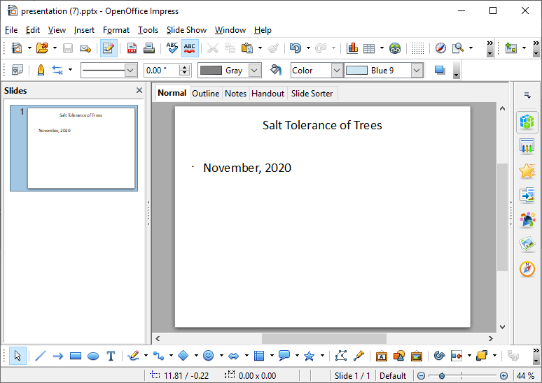
Below a title slide is created.
# import Presentation class
# from pptx library
from pptx import Presentation
from pptx.util import Inches, Pt
import pandas as pd
ppres = Ppt_presentation()
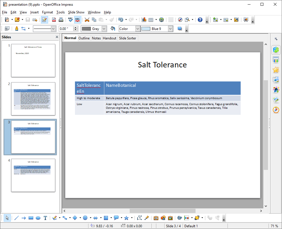
ppres.add_slide_text("Salt Tolerance of Trees","November, 2020")
ppres.save("presentation.pptx")
print("done")
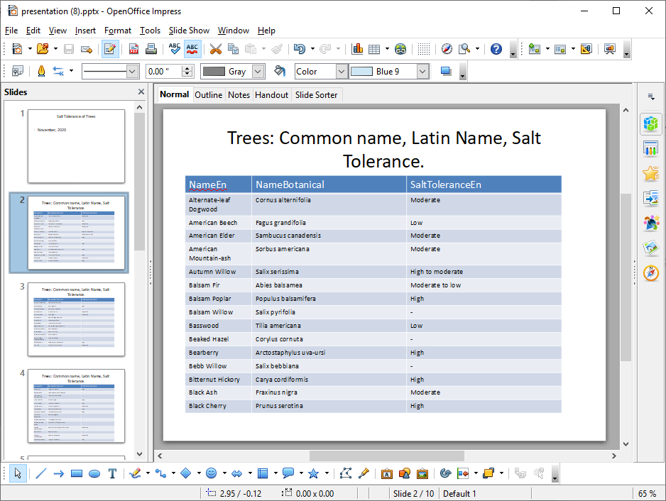
Next, I would like a set of slides with tables showing the common name of each type of tree, its botanical name and its salt tolerance. The data is read from Excel .xls into a dataframe.
The rows and columns to be presented in the table are selected from the dataframe:
# Specify the rows and columns from the spreadsheet cols_df = trees_df.iloc[0:132,[1,3,16]]
The column widths of the table in Powerpoint are set:
col_widths = [1.5,3.5,3.5]
The add_slides_table_df method of Ppt_presentation class is called:
ppres.add_slides_table_df(cols_df, 15, “Trees: Common name, Latin Name, Salt Tolerance.”,col_widths)
# import Presentation class
# from pptx library
from pptx import Presentation
from pptx.util import Inches, Pt
import pandas as pd

ppres = Ppt_presentation()
ppres.add_slide_text("Salt Tolerance of Trees","November, 2020")

spreadsheet_path = "/content/trees.xls"

trees_df = pd.read_excel(open(spreadsheet_path , 'rb'),  header=0)
# We have some missing values. These need to be fixed, but for purposes today, replace with -
trees_df = trees_df.fillna("-")

# Specify the rows and columns from the spreadsheet
cols_df = trees_df.iloc[0:132,[1,3,16]]

# Add slides with tables of 8 rows from the dataframe
# Specify the column widths of the table in inches
col_widths = [1.5,3.5,3.5]
ppres.add_slides_table_df(cols_df, 15, "Trees: Common name, Latin Name, Salt Tolerance.",col_widths)

ppres.save("presentation.pptx")
print("done")
Slides grouping trees by their salt tolerance is useful when considering trees for a particular site. The dataframe is sorted and grouped per below:
# Group results in dataframe by unique value # Sort values for second column salt_tolerance_df = trees_df.sort_values([‘SaltToleranceEn’,’NameBotanical’]) salt_tolerance_df = salt_tolerance_df.groupby([‘SaltToleranceEn’])[‘NameBotanical’].apply(‘, ‘.join).reset_index()
# import Presentation class
# from pptx library
from pptx import Presentation
from pptx.util import Inches, Pt
import pandas as pd

ppres = Ppt_presentation()
ppres.add_slide_text("Salt Tolerance of Trees","November, 2020")

spreadsheet_path = "/content/trees.xls"

trees_df = pd.read_excel(open(spreadsheet_path , 'rb'),  header=0)
#We have some missing values. These need to be fixed, but for purposes today, replace with -
trees_df = trees_df.fillna("-")

# Specify the rows and columns from the spreadsheet
cols_df = trees_df.iloc[0:132,[1,3,16]]

# Group results in dataframe by unique value
# Sort values for second column
salt_tolerance_df = trees_df.sort_values(['SaltToleranceEn','NameBotanical'])
salt_tolerance_df = salt_tolerance_df.groupby(['SaltToleranceEn'])['NameBotanical'].apply(', '.join).reset_index()

#Add slides with tables of 2 rows from the dataframe
col_widths = [1.5,7]
ppres.add_slides_table_df(salt_tolerance_df, 2, "Salt Tolerance",col_widths)

ppres.save("presentation.pptx")
print("done")
These slides are simple and need more formatting, but that can be done with Python-pptx too.
LiDAR captures details of the Earth’s surface and LAS files contain these data in 3 dimensional points of x, y and z coordinates. I want to take these data and use them to model some of the objects LiDAR detects.
I’m using Python’s laspy library, documented here and installed per below.
!pip install laspy
Laspy works with LAS files. The file I’m working with is from Pennsylvania and this type of data is available for a wide number of geographies. Here’s a list of LiDAR sources for Canadian provinces.
Open the file:
import numpy as np
from laspy.file import File
inFile = File("/content/drive/My Drive/MaskCNNhearths/code_and_working_data/test_las/24002550PAN.las", mode = "r")
From the laspy tutorial, here is a list of fields in the LAS file.
# Code from the laspy tutorial https://pythonhosted.org/laspy/tut_part_1.html
# Find out what the point format looks like.
pointformat = inFile.point_format
for spec in inFile.point_format:
    print(spec.name)

print("------------")

header = inFile.header

print(header.file_signature)
print(header.file_source_id)
print(header.global_encoding)
print(header.guid)
print(header.max)
print(header.offset)
print(header.project_id)
print(header.scale)
print(header.schema)

print("------------")

#Lets take a look at the header also.
headerformat = inFile.header.header_format
header = inFile.header
for spec in headerformat:
    print(spec.name)
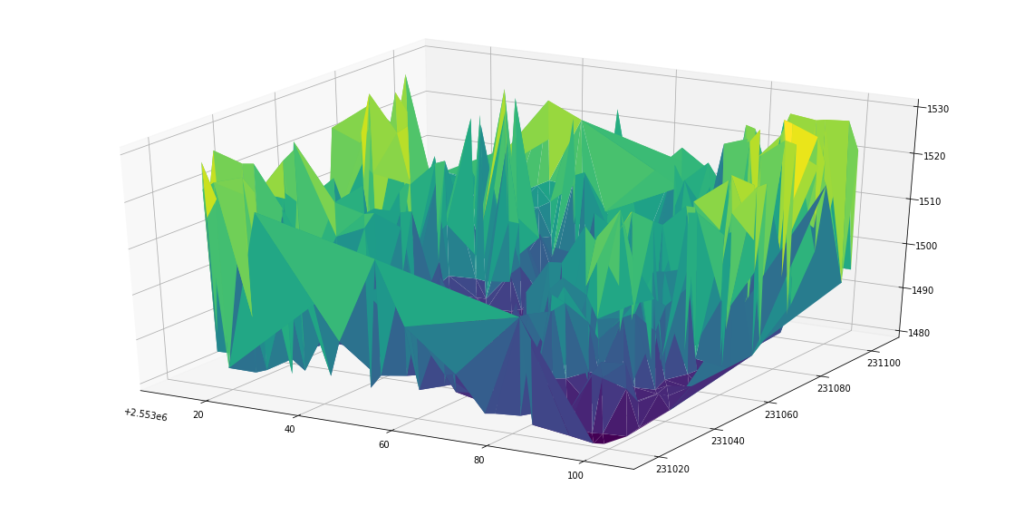
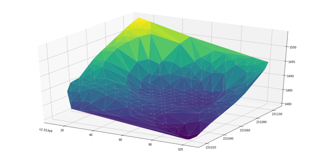
Initially when I looked at plotting data in LAS files, I saw results that didn’t resemble the landscape, like below:
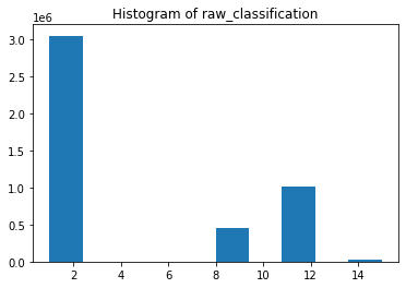
The points have a raw_classification (see below). Sorting for points where raw_classification = 2 provides a closer representation of the surface.
%matplotlib inline
import matplotlib.pyplot as plt
plt.hist(inFile.raw_classification)
plt.title("Histogram of raw_classification")
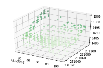
Below, the points in the LAS file are reduced to those that are just raw_classification = 2 and are within coordinates (2553012.1, 231104.9) and (2553103.6,231017.5).
Following the previous post, this is a photo filter using the TRS-80 Color Computer’s higher resolution graphics.
Resolution: PMODE 1,1 has 128 x 96 pixels on the screen. I have used a grayscale photograph resized to 128 x 96.
Colors: PMODE 1 has two sets of four colors: [green, yellow, blue and red] and [buff, cyan, magenta and orange].
This program loops through each pixel in the grayscale photograph and converts it to a value representing one of the available four colors, depending on how dark the original pixel is. I am using yellow, green, red and blue to represent light to dark.
In PMODE 1 graphics represent bytes that store values for four pixels in a horizontal row. Two bits for each pixel represent its color: 00b or 0 is green. [or buff] 01b or 1 is yellow. [or cyan] 10b or 2 is blue. [or magenta] 11b or 3 is red. [or orange]
00011011 is a byte representing a green pixel, yellow pixel, blue pixel and red pixel. 00000000 4 green pixels 11111111 4 red pixels 01010101 4 yellow pixels
What is a little different from the previous program is POKE is used to store the byte values into video memory of the TRS-80. Storing the byte values in DATA statements rather and individual POKE statements made the program smaller and faster to load and run. Below is the python to generate the program. Here is the Color Computer program I load into XRoar Online.
def pixel_to_bit(pixel_color):
    #green,yellow,blue,red
    if pixel_color<48:
        #red 10
        color_bits=2
    if pixel_color>=48 and pixel_color<96:
        #blue 11
        color_bits=3
    if pixel_color>=96 and pixel_color<150:
        #green 00
        color_bits=0
    if pixel_color>=150:
        #yellow 01
        color_bits=1
    return color_bits

file = open('C:\\a_orgs\\carleton\\data5000\\xroar\\drawjeff_pmode1.asc','w')
file.write("1 PMODE 1,1\r ")
file.write("2 SCREEN 1,0\r ")
for row in range(0,96,1):
    file.write(str(linenum)+" DATA ")
    for col in range(0,127,4):

        linenum = 10+row*96+col
        #PMODE 1 - Graphics are bytes that store values for 4 pixels in a horizontal row
        # 2 bits for each pixel represent its color.
        # 00b 0 green or cyan
        # 01b 1 yellow or
        # 10b 2 blue
        # 11b 3 red
        # 00011011 is a byte with a green, yellow, blue and red pixels
        # 00000000 4 green pixels
        # 11111111 4 red pixels
        # 01010101 4 yellow pixels
        byte_val=0
        for byte_col in range(0,4):
            color_bits=pixel_to_bit(resized128x96[row,col+(3-byte_col)])
            byte_val=byte_val+(color_bits*(2**(byte_col*2)))
        #memory_location = int(1536+(row*(96/4)+(col/4)))
        file.write(str(byte_val))
        if(col<124):
            file.write(",")
    file.write("\r ")

file.write("9930 FOR DC=1 TO 3072\r ")
file.write("9935 READ BV\r ")
file.write("9940 POKE 1536+DC,BV\r ")
file.write("9950 NEXT DC\r ")

file.write("9999 GOTO 9999\r ")
file.close()
This week in our seminar for HIST5709 Photography and Public History we discussed a reading from Nathan Jurgenson’s The Social Photo. He describes the use of image filters to give digital photographs an aesthetic that evokes nostalgia and authenticity. Below is a description of a retro image filter inspired by the Radio Shack Color Computer.
I was very fortunate that my parents bought this computer when we moved to Ottawa in 1983. I learned a lot using it and I used it a lot. As much as I loved it, I found its basic graphic mode odd. Coloured blocks were available, but instead of being square they were about 1.5 times tall as they were wide. (See a list of the yellow blocks below.)
While I used these blocks for a few purposes, like printing large letters, their rectangular shape made them less satisfactory for drawing. Still, they are distinctive. I wanted to see if I could make an image filter with them and evoke a sense of the 1980’s.
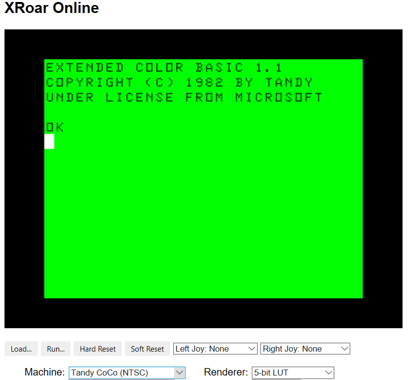
I used the Xroar emulator as a virtual Color Computer rather than going fully retro and using the actual machine. See: https://www.6809.org.uk/xroar/. It takes a few steps to set up on a computer. There is an easier to run on-line version of the CoCo at: http://www.6809.org.uk/xroar/online/. To follow along, just set Machine: “Tandy CoCo (NTSC)” in the menu for XRoar Online.
Above: Color Computer running on XRoar Online.
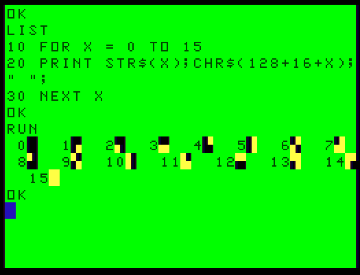
To see one of these graphical blocks, type in PRINT CHR$(129) and hit Enter in XRoar. (And note that the CoCo keyboard uses Shift+8 for ( and Shift+9 for ). Try a few different values like PRINT CHR$(130) or 141 and you will see rectangular graphics like the yellow blocks in the screen above.
Using these to represent a photograph provides a maximum resolution of 64 pixels wide X 32 pixels tall. (The screen is 32 characters wide with 16 rows.) I wanted to leave a row for text, so I used a resolution of 64 X 30. However, since the pixels are 1.5 times taller than wide I would use a photograph with an aspect ratio of 64X45 (30*1.5).
I used the picture below. It’s a screen grab my daughter took that has some contrast and could be used for my Twitter profile.
Raw image in grayscale. It’s 192X135 or 3 times larger than 64×45.
Here’s the Python code I used:
# import the necessary packages
# Credit to: Adrian Rosebrock https://www.pyimagesearch.com/
from imutils import paths
from matplotlib import pyplot
import argparse
import sys
import cv2
import os

import shutil
from pathlib import Path
img_local_folder = "C:\\xroar\\"
path = Path(img_local_folder)
os.chdir(path)
# 192X135 is used since it's a multiple of 64X45.
img_file_name = "jeffb_192x135.jpg"
hash_image = cv2.imread(img_file_name)

# if the image is None then we could not load it from disk (so skip it)
if not hash_image is None:
    # convert the image to grayscale and compute the hash
    pyplot.imshow(hash_image)
    pyplot.show()

    hash_image = cv2.cvtColor(hash_image, cv2.COLOR_BGR2GRAY)
    pyplot.imshow(hash_image,cmap='gray')
    pyplot.show()

    # resize the input image to 64 pixels wide and 30 high.

    resized = cv2.resize(hash_image, (64, 30))
    pyplot.imshow(resized,cmap='gray')
    pyplot.show()

else:
    print("no image.")
A flattened 64X30 image.
Let’s convert this to black and white.
#convert the grayscale to black and white using a threshold of 92
(thresh, blackAndWhiteImage) = cv2.threshold(resized, 92, 255, cv2.THRESH_BINARY)
print(blackAndWhiteImage)
pyplot.imshow(blackAndWhiteImage,cmap='gray')
pyplot.show()
A black and white version.
This image needs to be translated in order to import in into the CoCo. We will turn it into a BASIC program of PRINT statements. Here is a sample of this very simple and inefficient program.
This program is generated by Python. Python loops through squares of 4 pixels in the black and white image. For each pixel that has a color of 255/white, the appropriate bit (top/bottom, left/right) on the rectangular graphic block is set to having color.
file = open('C:\\xroar\\xroar-0.35.2-w64\\drawjeff.asc','w')
for row in range(0,30,2):
    for col in range(0,64,2):
        linenum = row*64+col
        # bit 1 is lower left
        bit1=0
        # bit 2 is lower right
        bit2=0
        # bit 4 is top left
        bit4=0
        # bit 8 is top right
        bit8=0
        # if a pixel is white (255) - set the bit to 1 (green) else, the bit is 0 (black)
        if(blackAndWhiteImage[row,col]==255):
            bit8=8
        if(blackAndWhiteImage[row,col+1]==255):
            bit4=4
        if(blackAndWhiteImage[row+1,col]==255):
            bit2=2
        if(blackAndWhiteImage[row+1,col+1]==255):
            bit1=1
        chr = 128+bit1+bit2+bit4+bit8
        # write the statement into the program.
        file.write(str(linenum)+" PRINT CHR$("+str(chr)+");\r ")
    # write an end of line statement if line is less than 32 characters
    #file.write(str(linenum)+" PRINT CHR$(128)\r ")
file.close()
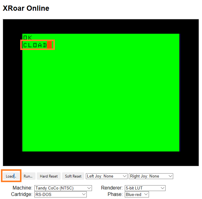
A sample of the generated program is here. To run it, in XRoar Online click Load and select the downloaded drawjeff.asc file. Then type CLOAD <enter> in the emulator. (See below.)
Loading will take a moment. Imagine popping a cassette into a tape recorder, typing CLOAD and pressing the play button. F DRAWJEFF will be displayed will the file is loaded.
This will appear during the loading of the file.
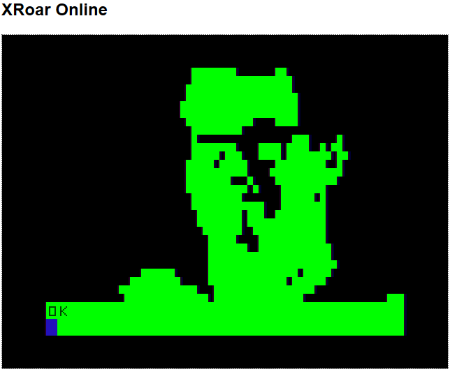
Once loaded, OK will appear. Type RUN.
A photograph image filter… Imagination required.
It’s neat that there is an on-line emulator for a computer from almost 4 decades ago. It’s also neat that Python can write programs that will run on it.
The book Getting Started with Extended Color BASIC is on the Internet Archive. I loved this book and think it’s an excellent introduction to programming. There are lots of ideas to try out on XRoar.
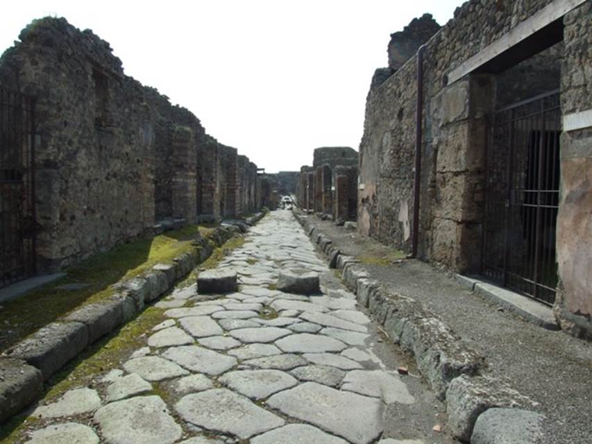
Image hashing is a process to match images through the use of a number that represents a very simplified form of an image, like this one below.
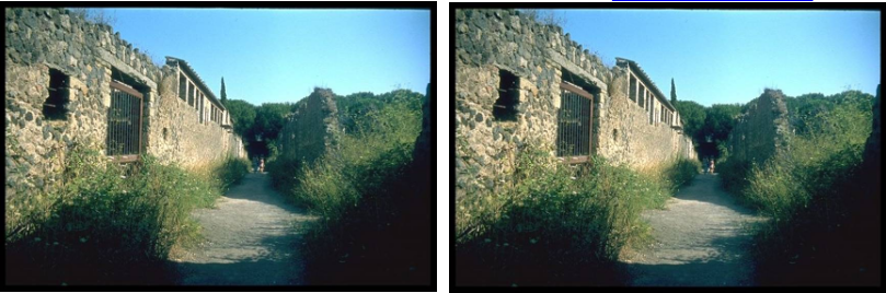
Original image before image hashing. Images courtesy of Pompeii in Pictures.
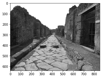
First, the color of the image is simplified. The image is converted to grayscale. See below:
Image converted to grayscale. Images courtesy of Pompeii in Pictures.
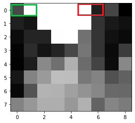
Next, the image is simplified by size. It is resized 9 pixels wide by 8 pixels high.
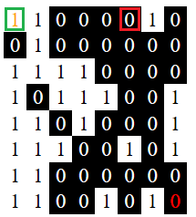
Image resized to 9 pixels wide by 8 pixels high. The green and red rectangles are relevant to describe the next step.
Adrian Rosebrock uses a differential hash based on brightness to create a binary number of 64 bits. Each bit is 1 or 0. Two pixels next to each other horizontally are compared: left and right. If right is brighter, bit = 1. Bit = 0 if left is brighter. See below:
The result of the image hash for the image above. The 1 inside the green square is the result of the comparison between the 2 pixels in the green rectangle in the picture above. The same thing is true for the o inside the red square. Inside the red rectangle two images above, the pixel on the left is brighter, so 0 is the result.
This process produces a 64bit binary number: 0101001100000011101001111000101110011101000011110000001001000011
This converts to decimal 5981808948155449923.
Matches
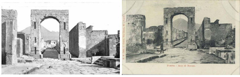
A match of copies of an image.An interesting match of similar images.
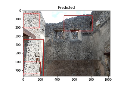
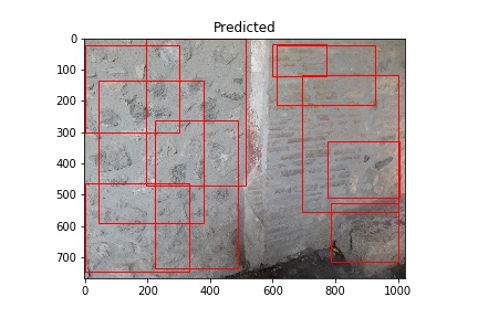
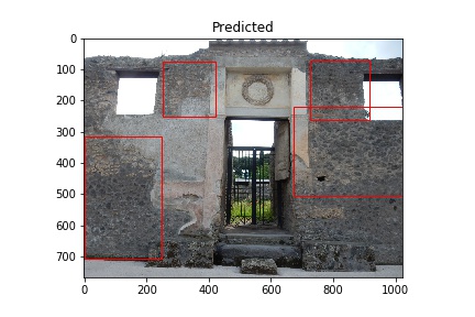
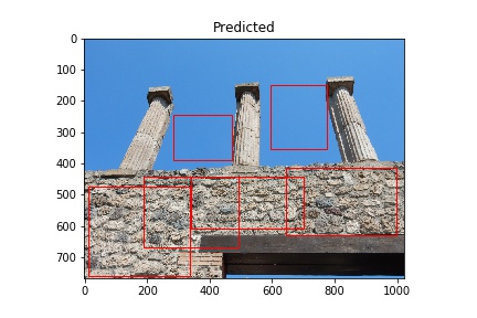
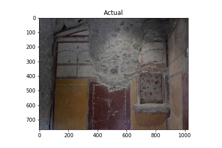
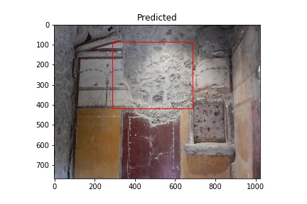
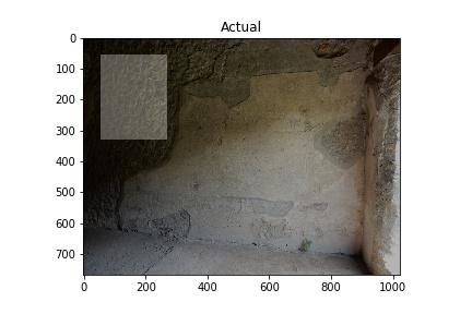
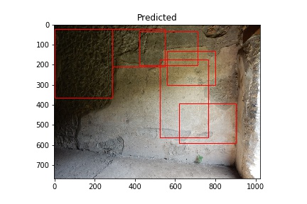
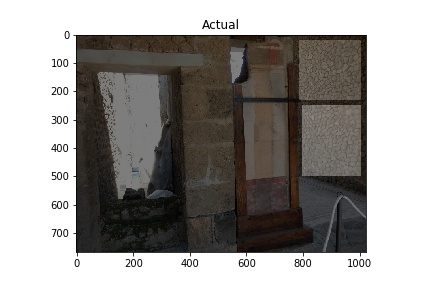
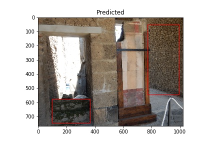
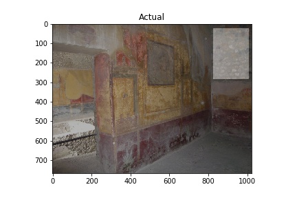
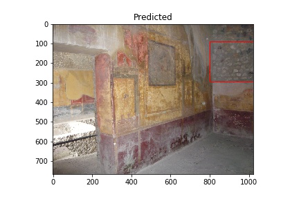
I am building a project to detect wall construction types from images of Pompeii. I am using Waleed Abdulla’s Mask R-CNN for object detection and instance segmentation on Keras and TensorFlow. Also, I employ the technique described by Jason Brownlee in How to Train an Object Detection Model with Keras to detect kangaroos in images. Instead of kangaroos, I want to detect the type of construction used in building walls.
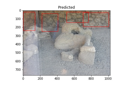
This is a brief post describing the preparation of images for training as well as the initial results. The images used are from the Pompeii Artistic Landscape Project and provided courtesy of Pompeii in Pictures. The original images were photographed by Buzz Ferebee and they have been altered by the program used for predictions. An example of an image showing the model’s detection of construction type opus incertum is below. Cinzia Presti created the data used to select the images for training.
The red rectangles note the model’s prediction of opus incertum as a wall construction type. Image courtesy of Pompeii in Pictures. Originally photographed by Buzz Ferebee.
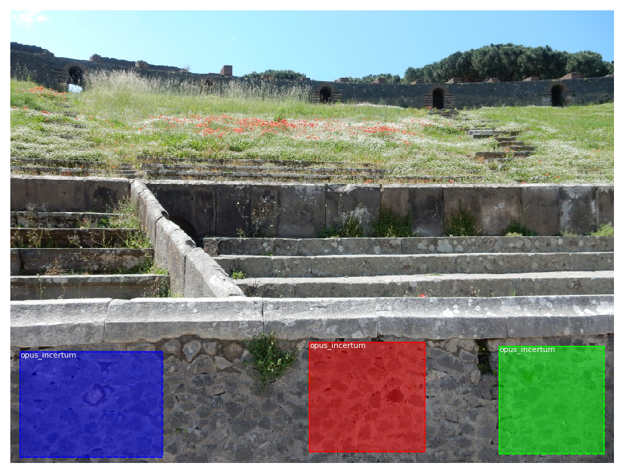
To build this model, images were selected for training. Given the construction type is visible in only parts of each image, rectangles in each image show where the construction type is visible.
Image showing areas designated for training the model to detect opus incertum. File name: 00096.jpg. Image courtesy of Pompeii in Pictures. Originally photographed by Buzz Ferebee.
Each of the images has a corresponding xml file containing the coordinates of the rectangles that contain the objects used to train on. See file 00096.xml below:
The program to create the xml annotation files also saves images using a standard numeric file name (ex.: 00001.jpg) and width of 1024 pixels.
Initial Results
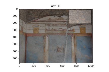
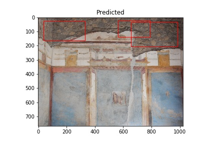
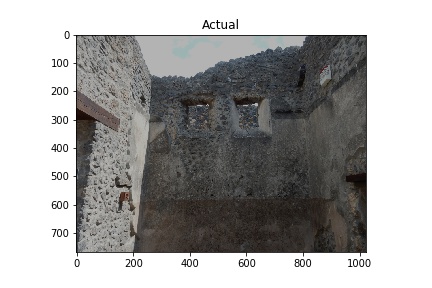
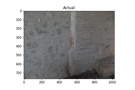
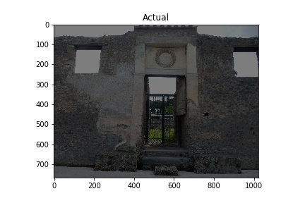
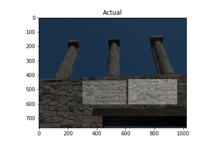
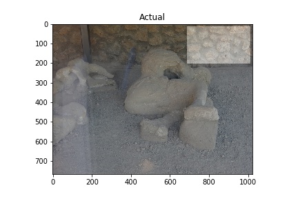
The “Actual” column of images below shows images used in training the model. The white rectangles show the boundary boxes contained in the corresponding xml file for the image. Some images don’t have a white rectangle. These images were deemed by me not to have a good enough sample for training so I didn’t make an xml file for them.
The “Predicted” column shows what the model considers to be opus incertum construction. Frequently it’s correct. It does make errors too, considering the blue sky in row 5 is recognized as stone work. I want to see if further training can correct this.
A couple things to note: It’s bad practice to run a model on images used to train it, but I am doing this here to verify it’s functioning. Later, I also need to see how the model performs on images with no opus incertum.
Training images (Actual) and Predicted images with red rectangles showing predicted matches from the model. Images courtesy of Pompeii in Pictures. Originally photographed by Buzz Ferebee.
References
Abdulla, Waleed. Mask R-CNN for object detection and instance segmentation on Keras and TensorFlow. GitHub repository. Github, 2017. https://github.com/matterport/Mask_RCNN.


